Friday, October 31, 2008
Assignment 6 MORE
I think what I could do better is to pay attention to more details and think about things before I do it. This way the details would be more clearer and be snappier and if I think about it then the work will be better. I think what I did do good was I made people not be able to see that I was myself in the Cleopatra picture. I also showed some emotion in the photos I took for this assignment. I was really happy about that.
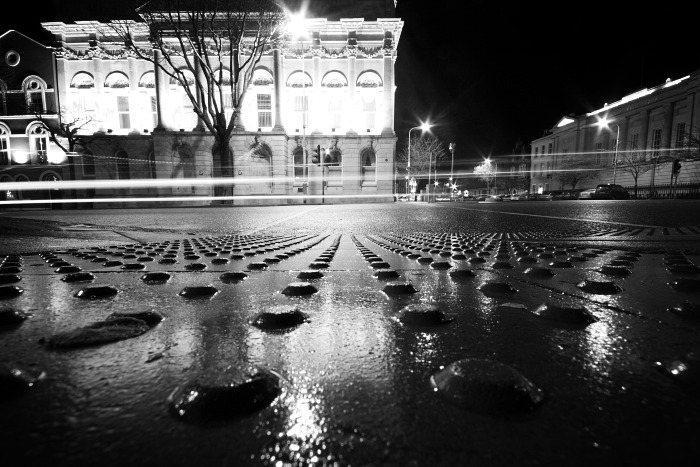 I really like this photo and I don't know who it's by and I got it at http://farm1.static.flickr.com/129/350249795_c5448f693b_o.jpg. I like the nighttime exposure so the lights are a line because of the movement so it's blurred into light in a line. I like the bright building in the back with the tree in the middle of it. I like the street lights on the right side of the photo how they're flashing and sparkling. I like the dots on the floor and how they're arranged in a different shape. Some go straight, some go diagonal, so it's like an arrow. I like how they're straight and diagonal so it draws my eyes to different parts of the photo. The straight lines draw me forward to the building and the tree. The diagonal lines draw me to the other parts of the picture, like the sides. The parts of the picture where you don't notice as much, it helps you to. I like how it's black and white because it shows a more old and classy side of this place like it's the start of the 1900s and there's people going to old movies and girls with curls in their hair going to operas or dressing up.
Ripples

I really like this photo by Jeff Alu of the leading lines. I got it at http://www.bmreview.com/images/jeff_alu/images/Jeff_Alu_leading_jpg.jpg. It's a pattern and leading lines. It makes me see all the way out to the end of the photo but doesn't lead my eyes off the photo because the end of the leading lines doesn't end at the edge of the photo. It ends with the sky so my eyes stay in the photo wanting to know what more is happening in the photo. I really like the pattern of the lines that look similar to each other but are different shapes though. This is very cool. I like how it's black and white so you can see the gray of the lower level and the black of the lines. I like the simplicity of it, how it's only lines and nothing more. It makes the photo very cool.
Thursday, October 30, 2008
Assignment-6 PORTRAITS
 I really enjoyed this assignment because it was really fun. It wasn't easier or anything, but it was fun taking pictures of other people because I had many jokes and laughs with them. My mom and I kept joking around and laughing while we did ridiculous poses and did ridiculous jokes. For my self portraits, my mom had to stand in place of where I wanted to be and then I would adjust the white balance and lighting and the view from the camera. Then she would stay there and I would go over and pose where I asked her to so it would look the same or I would tell her what part of her body was where in the screen of the camera. Then she would come back and snap the photo. We did all this with a tripod. For the first photo of Zephani Huang, we went over to her house during lunchtime on Wednesday because she lives off of 9400 S. so it's really close. I snapped photos of her and she had this cool scarf so I asked her to wrap it around like that and only show one eye for emotion. I really like how it's upclose and only shows her face and hands and the scarf. It's very mysterious. The second picture, I was trying to have a Hollywood essence about me. More of a 1960's and earlier time so I put on red lipstick and lined my eyes with black liner. I tried to portray different sides of Hollywood in the assignment. I did girly, mean, and classy. The black dress is my mom's and I barely fit in to it. I really like this photo because how the dress is spread out is so girly and classy and how it's an black dress with red lips. The third photo is me trying to be Cleopatra. I didn't have the exact white dress and the gold accessories and headdresses, but the details and the eye makeup tells the story. I wanted to show that Cleopatra could be mean and have control. I really like how close the photo is and how it shows the details of the headress and the eye makeup. It really shows emotion even though it's just through the eyes. The fourth photo is of my mom and I took it of her and her reflection in the mirror. I love reflections. I think they're awesome! I like the expression on her mouth how it's different than regular ones. I like how the reflection is looking back at the viewer rather than herself. The fifth photo is of my mom and I took it while she wasn't paying attention that I took it of her. This way it would be blurry and more natural in action rather than posed. She was in the middle of getting ready of a pose and I snapped it. She didn't know which made it even better. I like how it's blurry so there's several images of herself looking ghostly around her. The whole thing is blurry yet clear because it's literally blurry but you can still tell what's going on. I am really starting to freak out about my final portfolio! I haven't started it yet! I'm really really x 100 starting to worry.


Tuesday, October 28, 2008
Shopping Carts

I really like this photograph but I don't know who it's by. I got it at http://www.photoaxe.com/wp-content/uploads/2007/12/pattern.JPG. I originally thought it was buildings with things on them and pictures on the sides, then when I looked at it again I figured out it was shopping carts. I really like the shopping cart pattern with the grids and the handles. I really like the simplicity of color and the complexity of the pattern. It's really cool. I love how the pattern continues and is a leading line that draw your eye to the top left corner and leaves me wanting to see farther what is there: whether it's carts or something else. I like how there's so many of the carts and it just fills up the screen. I love it.
Thursday, October 23, 2008

I really like this photo of the water and the forest and rocks. I like how the sidewalk is a leading line for the forest. It leads you to the darkest strongest color part of the photo. I like how the green is such a rich green and how it's the darkest thing in the photo. The water makes me feel peaceful like I could just relax in it and float in it forever. It makes me feel very happy and like traveling and vacation at St. Bart's or Grand Cayman or something like that. The view is also beautiful.
Assignment-5 LIGHT
 I really enjoyed this assignment but it was harder than the last one because you had to find light that was good and even though it was everywhere, it was hard to find good ones because you had to set it up sometimes but most of the good ones came from natural light. I found a lot of them just by sitting there getting bored or walking around. All the good ones I took were taken when I wasn't thinking about it too much, just letting it be. I really like the first photo a lot because there's not a distinct foreground or background. It could be seen as a table or anything else. I like how it's a little abstract. I didn't even think of taking a photo like that. I was just sitting in my parents' car and as they drove down Highland Dr. I saw the light shine through the sunroof like that and it was beautiful. I was lucky that they just happened to bring my camera in the car or else I would have missed it. During this assignment there were so many times when I was like oh that's so beautiful but crap I don't have my camera! I was so mad! The second photo was in my bathroom. I was just running out of ideas for the assignment last night and I was getting worried, so I started walking around my house looking for good things to take pictures of. I went into my bathroom and I just remembered that there was that window there so I took it at a couple of different angles. I like how the light is on the top and that there's contrast in the photo. I like how you can see the depth from the lines of the angles of the thing leading to the window. The two also are acting as leading lines bringing you to the brightest light. The third one I didn't think would be that good but it turned out pretty good. I like how the rug separates the reflection and the real thing. I took it when I was standing there taking pictures of other things also. I like the brightness of the light. The fourth one with the nighttime was taken accidentally. I was holding the flashlight turned on under my chin and I went in front of the camera without covering the flashlight and I came back without covering the flashlight so since the flashlight was under my chin it emphasized my head. This is why it looks like my head is floating and you can barely notice my body being there. I love the floaty effect. I actually don't like the fifth one as much. I don't think it's as strong as the other pictures. The stuff in the background seemed distracting and the composition just doesn't seem right. I like the contrast and the lighting but not the composition. I don't think much about that one. Haha.


Tuesday, October 21, 2008
Braided Black Hair
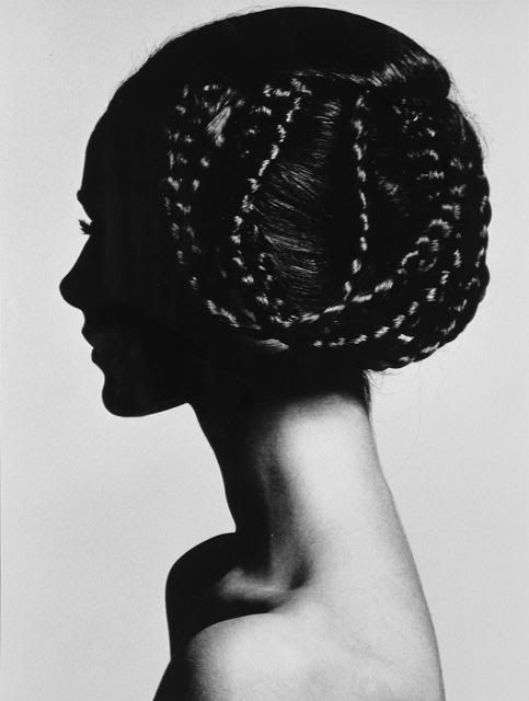
I really like this photo by Horst P. Horst and I got it at http://i141.photobucket.com/albums/r68/giancarletto/PHOTOGRAPHY/HORST/483Horst.jpg. I really like this photo because it's very simple except for the hair which is the main point. I like how the only detailed thing is the braided part of the hair. It tells the viewer exactly where the main point is. I like how the only dark thing with light on it are the braids and everything else is either plain, shadowed, lighted, or gray. The shinyness of the hair really brings out the photo. It makes it feel so ladylike and so 1800s rich girl. It reminds me of the time periods where they the rich lived in Manhattan, NY and how they got dresses and fancy gloves and hairstyles. This is like that except it's more modern because it's without the dress on her which makes a difference. If the dress was on her then it would look like a side view portrait from a person in the 1800s rather than photo like.

I really like this photo by Hurst P. Hurst and I got it at http://www.forbesgalleries.com/assets/corset.jpg. I really like how feminine it is with the corset and the soft light. I like how she's so graceful in her actions about taking off the corset and how the gracefulness is portrayed even more by the soft white lightcast on the middle of the corset. I like how the attention and details is on her corset rather than the other things in the photograph. I also like how the hairstyle of the lady matches the grace and femininity of the photograph and her corset. I like how the light doesn't get very dark until the very top where the attention of the photograph isn't at.
Friday, October 17, 2008

I really like this photo by Hurst P. Hurst and I got it at http://www.gallerym.com/images/work/big/HORST_P_HORST_ROUND_THE_CLOCK_I_1987_L.jpg. It's called Around the Clock. I can tell why that's the title because her dress goes around in a circle. I like this because of the lighting and the shadow cast on her legs and heels. It makes the dress and the lace on her tights beautiful! I like how the dress goes from dark to light. I also like it because it reminds me of ballet and I dance and the heels remind me of something beautiful like prom night when all the girls are wearing heels and being glamorous and girly. It's just so feminine but so strong. It makes me feel that the lady in the picture is very strong because her heels are dark and they're tall and black. Somehow that makes me feel like she's free and very independent like she can take care of herself and doesn't need a man.
COCO CHANEL!!!!!!!!!

I love this photo by Hurst P. Hurst of Coco Chanel, the designer. I got it at http://images.artnet.com/artwork_images_116810_271178_horstp-horst.jpg. I really like this because of the lighting and the girlyness of it all. I like how the light starts at her face and goes into shadow towards the bottom and sides of the chair and her skirt. I also really like feminine photos and this is really girly because of the jewelry, the shiny fabric of her skirt, the bow on her head, and the makeup on her. I like how they're leaves above the chair because it makes the photo more unique and doesn't make the wall as plain as it was. It adds to the photo. Also, I picked this photo partly because it's one of COCO CHANEL!!!!!!!!! I love her! Her handbags are iconic and her 2.55 bag is classic! Haha, now I'm getting off topic so I'll stop. Haha.

I don't like this photo by Eddie Adams which I found at http://www.arkitectrue.com/wp-content/uploads/2007/02/0228_murder-vietcong-saigon-police-chief-eddie-adams.jpg. I don't like it because it's so violent with the man shooting the other man. It's in Vietnam during more violent times. It makes me feel scared and it's a darker image and violent. I don't like photos that make me feel like this. I don't like photos of war and soldiers or blood and the dead. It's too violent to think about for me.
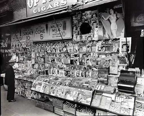
I really like this photo by Berenice Abbott and I got it at http://www.murphsplace.com/crowe/braddock/images3/abbott-newsstand.jpg. I really like this because of all the different variety of magazines on there. It's different things and I like how they're so crammed together but you can still tell that each one is unique and different. I like how there's a man standing on the left looking at the newsstand because it makes the photo look more realistic and I like the cigar and milk signs at the top. It makes the magazine stand look more not modern and more close to home like somewhere you'd go everyday. I like this photo a lot and also because it's black and white. If it was color then it'd be not as cool because not every color would be the same and with black and white only the design and shapes are different.
Thursday, October 16, 2008

This photo is by Bill Schwab and I found it at http://www.darknessdarkness.com/artists/schwab.jpg. I really like this photo because it gives an air of mystery. It seems kind of foggy and snowy. The snow almost looks fake because it's so pure and smooth and white. I like how the lights are in the background and not fighting with the tree. It adds to the photo and I really like how the snow is up the tree also but then there's black parts left so it adds contrast. I like the black thing that is lying in the snow. It breaks up the all white snow so it's more interesting. I like how the light in the background is reflected and that the snow eventually goes to thin ice and then blends to water. It's very smoothly done.

I couldn't find who took this photo but I got it at http://latimesblogs.latimes.com/photos/uncategorized/2008/07/15/lightfinal.jpg. I love the lighting in this photo and how it's coming from the subway and it goes from intense blinding light and fades out onto the train station. It makes the platform go from light to dark from left to right. I love the lighting on this. It's beautiful. I love how it's black and white also because it makes the light stand out more than if it was color. I just love this photo! The composition is really cool too and the platform doesn't take up most of the photo either. My eyes go straight to the train because it's the brightest thing in the photo. I LOVE THIS!!!!!!!!!!!

I like this photo but I don't like it at the same time. I couldn't find who took it but I found it at http://www.blackphoto.com/images/lessons/night/header_photo.jpg. I don't like this because it's too busy and too colorful and there's just way too much going on. There's the spinny ferris wheel and then the other orange thing on the bottom left. Then there's the hot pink doors on the bottom right. I really like it though because how the ferris wheel is blurred because of the longer exposure during nighttime. It reminds me of Final Destination 3 the movie because the people die on the roller coaster and a lot of the movie happens at carnivals, festivals, or amusement parks. This is a more positive image than the movie though.

This photo is taken by Jan Leonardo Wollert and I got it at http://gallery.photo.net/photo/7187281-md.jpg.
I really like this photo because of the circles of lights. I did not know what it was at first but I asked Mr. Slade and he told me it was something in a factory and they put lights on the spinning things. I thought it was really cool because although there are different things in the picture your eyes go straight to the light circles because it's brighter and more colorful. It's more scientific cool though instead of powerful photo. I still like it though. I like how the angle of the photo is so you can see all the circles leading back to the door leading your eyes back.
Assignment-4 HERO ANGLE


I really enjoyed this assignment because I thought it was really cool to photograph things from a different perspective and see simple things differently. This assignment went really well and I thought it wouldn't because I barely got it done last night, but it ended up being pretty good. The shoes picture I really like and I thought of it last minute. It was the last picture in my assignment and I thought it would be different from my other pictures. You can still tell that it was photographed low but instead of doing things that were already in nature, I set it up this time using myself and instead of taking a traditional feet straight up and in front I decided to slant my feet and pull one of my socks down. I took the next one of my back porch during the day it snowed. It was really cold and I was wearing snowpants and a snow jacket having barely just finished breakfast. I was laying half down on the ground and freezing but I really like it because you can tell that it's low because it looks just barely over the porch.
 The tire one you can tell is low because there are the trees in the background telling you it's low and because the tire is obviously touching the ground and is the same height as how I took the photo. I like that one because there's not too much ground in front of the tire but there's not too little and there's light and shadows from the tire to the side. I like the line in the cement because it's very simple and it's obvious that I took it low. It's simple but it does and finishes all the work. It makes a strong image even though there's only one thing in the photo. The road one was where my driveway slanted down and the road was a bump up. I was sitting down right after I took the one with the line in the sidewalk and I saw that I thought it would be good. It turned out really nicely and you tell it's low because of the background and the road itself. That one is one of my favorites.
Tuesday, October 14, 2008

This is a photo by James Nachtwey and I found it on http://maryt.files.wordpress.com/2007/03/nachtway1.jpg. I really like this because it shows the cultural side of his people and race and religion. It shows that he is very serious about it and his emotion is serious and concentrated shown from his facial expression. I really like this because there's the person, the smoke, the picture, etc. It looks like a funeral because there's a picture of a person and the praying but I'm not sure because it has the elements of a Chinese funeral except less fancy. You can tell he's the main subject because your eyes are drawn straight to him because of his facial expression and how everything else isn't that clear or focused.
 This is a photo by W. Eugene Smith and I got it at http://chasearoni.files.wordpress.com/2008/04/weugenesmithwalk_4.jpg. I really like the lighting of this photo how everything is black and the only thing bright is the circle with the kids in the middle. It immediately tells you what the subject is. I really like it in black and white because if it was color then you wouldn't be able to tell the black and white so sharply. I just really like how the two people are kids and not adults. It shows the innocence and the feeling of not being in the world for a long time yet. I really like it. It makes me remember when I was a kid and how I would like to play and search for different places not to far from where my parents were.
I really like this photo by Cindy Sherman and I got it from http://www.nga.gov/exhibitions/2007/snapshot/snapshotinfo-lg.jpg. I really like this photo because it shows that she's kind of shy because she doesn't want people to see her facial expression and how she feels and looks. I also like how the background and the subject are not fighting for attention; how the background is a plain field of grass and fence. I like how she's the only thing that's in focus showing us that she is the subject. I also like how the photo is in black and white because that's more simple. Color would have ruined it because it wouldn't have shown her shyness as well and more simply.
Thursday, October 9, 2008

I really like this photo by a Japanese person and I found it at http://deeplinking.net/wp-content/uploads/2007/07/barer.jpg. I didn't realize it was a book until I looked at it more closely. I thought it was just paper put together, and I thought it was really cool how you don't realize what it is until you really look at it. I like how there's two colors to the picture: black and white. The color is very simple and I like how it's shaped like it's round. I like the abstract feel of it that you think it is when you first look at it. It's very cool.

I really like this photograph of the building by Jim Korpi and I found it at http://farm1.static.flickr.com/157/436551037_0653a31c36.jpg. I really like this photo because it's very simple and I like the mystery of it all. I like how the fog and cloudy skies are surrounding the building and how the windows go from big to small. It's a good composition factor of perspective. I like how the angle of the building is in the center and how the building is in a specific shape. I love how the building fades out into the rest of the photo. It seems very dark and mysterious and it wouldn't be the same if it wasn't black and white because it only makes me feel that way because of its color.
My Project Proposal
I want my project proposal to be a day in the life of green apples. I will get a dark green apple and a light green apple like I did in my project of emotions. I will do it from when they are in bed to the darker green one working, the lighter green one doing chores, the kids represented by mini green apples doing homework. I want to portray a normal life of my family, but incorporated into apples instead of humans to make the project more unique and more unexpected. I will think about what my family does daily and do the same thing for the apples. I want this to be a fun thing but I want my viewers to view it as a unique and unexpected story. I want the story to be simple but different. I want viewers to feel fun and but realize how important everyday things are and how lucky we are to be able to live our lives like we are. Even though it's portrayed through something else, it sends out the same message. I also want people who feel like their parents don't love them to know how lucky they are and that their parents really do love them and that they should stay close to them. They should realize that family life is important and they shouldn't just put it aside like it's something that should be given to them.

I really like this photo because it represents another side of hope. Instead of achieving hope it shows a stabbing of hope, a hope that can never happen. It's a complete opposite with the sharp tops of the gate and the peaceful white and blue sky. I like how it's complete opposite and shows the false hope. I really like the color of the gate because it's true black, it's really black, so the contrast looks greater with the white sky.

I really like this photograph by Howard Schatz. I got it at http://www.apartmenttherapy.com/uimages/ny/12-17-white-water-4.jpg. I think it's really cool because all the pepole are in water dancing and I couldn't tell at first until I noticed the reflections and the light. Also they are slowly floating up so this photograph must have been taken fast for them not to float up. I like the light all around the people at the bottom of the pool. It is very beautiful. I also like how the swimsuits are very colorful and it adds a unique touch to the photo. Their reflection at the top is cool because it's gathered and it's another thing that makes the photograph unique.
Assignment-3 EMOTION


This assignment was really fun but a little harder because it was hard to get good ideas and take pictures of things that really expressed emotion but in a creative fun way. The first picture with the hat and the lips I took just yesterday and I really like that one because you can see the expression through just one part of the body and you can tell it's happiness. It tells a clear story through the lips. I also really like the one with the light shining through the gate as lines with a person in the back because I was trying to express hope. It seems as if the person is looking to the lines to the light for help to get hope. The flower I really liked because it expressed love and it was really up close showed the details of the flower with light shining in between its petals. I really love it. The one with the three cats was just fun because it showed a different kind of love: family love. I really like it because it's a more direct way of showing it and it makes me laugh because it's a fun photo. When I took the apple in the blankets one, I didn't think it would be a good photo, but somehow Mr. Slade really likes it. Haha. I can tell it's more creative than my other ones though and it shows love but with a different kind of thing. That's why I like it, because it's different.
Friday, October 3, 2008
Lady Wrapped in Fabric

I really like this photo from Rodney Smith because of the color and how the fabric is like her dress but then it goes into a more abstract feel so you can't really tell or see what the fabric is doing. I like the effect of that. I like how the color is like in an old 1950's photograph or movie. Her lipstick matches the photo and it looks really cool like that.
Subscribe to:
Comments (Atom)