Thursday, May 21, 2009
Panorama
I pass by the site of this construction every week and I never really notice it. To me, it was just there, it was something I passed by. I never really paid attention to it until I really got up close to it. I was looking for a cool panorama to shoot and I passed by the crane and the color and the height really got my attention. The one by it, which was black actually didn't catch my eye because it blended in and was normal. I loved it so I shot it and I was hoping it would turn out well, turns out it's one of my best panos. I love how the bottom of it is disproportionate because it adds to the photo, it's one little weird thing that you just have to notice. I would always go to the same old places to shoot, the park, my house, other people's houses, etc. and I really wanted to find new places, places that were hidden to me before. I wanted to find places that I had never shot before and I succeeded. I've realized through this that sometimes, the coolest photos are never in the places you expect them to be. They're in the most normal places boring places, but the photos turn out awesome because it's not something everyone shoots. People would usually be like, what is cool about this place? It's just a crane and there's nothing that cool about it, but there is. This photo is one of those. Before I found this crane, I was feeling frustrated that I couldn't find something good enough to shoot and when I saw this, the frustration didn't go away that fast, but there was a happiness in me. I think the crane shows my emotions from then, it's a red and it's successful and a great photo but the hard metal texture of the crane and its strength shows the little bit of frustration left in me at the time. I think the reason it's good is mainly because I was shooting how I felt and it somehow just came to me naturally rather than me trying to search everywhere for something that didn't fit.

Final Project
 This is more of my final project, apparently the last post wasn't the last of it. The first one is of a business building and there was a walkway between that building and another and the white in the photo is that walkway. I thought it would look so cool if I intersected the building and the walkway and the contrast of the colors is so great that it makes it the focus. I love the simplicity of the 3 colors and it's unique but it's so simple. The second one is of, I think, a restaurant, but I don't really remember what it is because I can't really tell what it is. I love how it's abstract even though you know it's a part of a building, you can't tell what part it is. I love how the yellow stands out against the blue and the purple. The shape and intersection of lines is also really interesting. The third one is of Bajio's. The side of the restaurant had these cool lines so I really wanted to take it. I love the shadows on one side and how it's light on the other side. The contrast is cool and I also love the sharp corners, the shape of it is awesome. It's simple, yet different.

Final Project

 These are my last photos from my final project. The first one is of the movie theater near my house and I loved the rectangular shape of the building with the rounded edge of the lower roof. It was a big contrast but it was totally cool. The color is similar too but it's still different enough to show the contrasts between shape. The second one is of the same movie theatre and I loved the layers of the signs and the lines and color of it. It's so unique and I love the layers how it creating different shapes and designs. I've wanted to shoot this sign for a year and I finally did it. Haha. I love the contrast between the red letters and the yellow back. The third one is of a business place and I loved the zigzag pattern of the building on top because usually buildings aren't zigzag, they're flat or rectangular. It's a simple shape but it's so unique, I love it. I love how the zigzags aren't all the same too, like when one of the places it caving in the layer below it is jagging out, so it makes it not too symmetrical. The fourth one is of another business building. There was a straight line going up and so I just stood close to the base of the building and looked up to take it. My first shot of it was too close and you couldn't see any details so I backed up a little and it was a lot better. I really like the symmetry and the intersecting lines. Sometimes symmetry is boring, but because of the cool lines and different colors, it's interesting. I like the gold on either side and it doesn't coincide with the other colors or take away the attention, it adds to the building.

Tuesday, May 19, 2009
Final Project


These are two more of my photos from my final project. The first one is from a part of the city hall of Salt Lake City and I originally had it not zoomed in as much but Mr. Slade told me to crop it and it looks way better. The detail is seen better and the uniqueness is seen better without all the stuff around it. I love the simplicity and color of it. It's just two colors and not too many colors. The one on the right is of the capital building and I love the angles and the shapes it takes, how it slants and then suddenly there's a dome. I also like the style of the architecture. I love how ancient it looks even though it's not. I love the shape and style!
Monday, May 18, 2009
Final Project
 These are some of the photos from my final project. I wanted to show a different view of buildings and architecture. I wanted to show the part of the building that was unique and different. The first one is of the Salt Lake Library with another metal structure by it. I thought it was really cool how the slanted edge of the library differs with the roundish shape of the structure by it, how the structure dips down. I love the shape of it. It's a simple combination but it's so much. The second one is of the library also but it's another view of it. I saw that little window sticking out and usually windows aren't that shape so I thought it was simple and unique. I didn't want the photo to be all that color so I added some sky into it to make the shape interesting. I like how the side of it slants down instead of being straight. The window isn't symmetrical and I really like that because it's not perfect but it's unique. The third one is of the Salt Lake City city hall and it's the bottom side of one of the sides. I love how the it's round closer to me and how the building slants out in the back. I love the differing shapes. I also really like the texture of the rock and how cool it can be when you sharpen it up. If it was just plain it wouldn't have been as cool and unique. I like the reflection in the window because it would have made the picture more plain without it. The green at the bottom adds to the photo also because it creates a contrast between the green and the yellowy color of the stone.

Monday, May 11, 2009

This is a photo I found on google images and I think it's really cool but I don't know who took it. I love the feel of it that it goes on forever because you can't see the end of it and it gets thinner and thinner. I love the lines on the side and top and bottom because it makes the photo more unique and less plain. People shoot stuff like this all the time but I think it's very unique because of the lines and the light is beautiful. I love how the light comes down and is very natural and subtle but it totally adds to the photo.
Wednesday, May 6, 2009
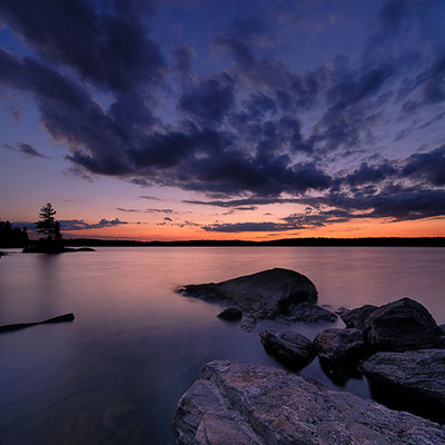
I don't know who this panorama is by either but I love the color of the sky and the orange on the horizon. I love how it looks like the sky will go on forever and it feels like the sky is right above your head low. The orange color really stands out amongst all that black and purple and blue. It creates a reflection of orange and it's beautiful. The rocks in the front of the image also add to make the image more unique rather than just another sky and horizon image.

I don't know who shot this panorama but I think the perspective is really cool. It makes it look like each side is leaning in but still straight. It's a different view than if you just shot it straight down and I love the one leading line down the middle leading to the small tall thing in the far center.
Monday, May 4, 2009

This is a photo by Henri Cartier Bresson and it's cool and creepy at the same time. I love the swirling stairs. The geometric shape of it is wonderful. It's so simple, yet so strong and complex at the same time. I love how all the heads are all squished together and it gets squishier and closer as it gets higher up. If the heads aren't there then it wouldn't be as cool because it would just be like any other spiral shape that photographers take, not as cool as this. He put a unique spin on it.
What Makes a Good Photo?
To make a good photo I think emotion is really important. If you feel one way but you try to shoot another emotion then the photo will turn out bad because it's not what you really want/feel. It's more fake and it's not sincere. Every image should have an emotion when the viewer looks at it because then it's a meaningful image having some importance to it showing the photographer's feelings. Another thing that's important is the composition. If it's bad composition then the photo won't be as strong and won't have as much feeling in it. If it's a good composition, most of the time, it automatically has emotion and feeling in it. When I shoot a good image, I have this feeling in me that the image is going to be strong. I think composition is more important than emotion because composition is basically one of the big factors that makes or breaks an image. A third thing that's very important is color. If the white balance is off then the whole image looks weird and it doesn't look as clean cut and good. I learned that lesson when I didn't really care about white balance and I was always like oh that looks close enough, but it wasn't. It turned out ugly and I couldn't print some images to turn in because of this. Color is what sharpens the image and it's what enriches the image. A vibrant red can cause lots of emotion and make the image strong while a bad red doesn't show anything. It shows bad white balance and bad color.
Assignment #4- Panoramas
 This is my other panorama. I finally got it to go on the blog. I don't like this one as much as my Wells Fargo building one and the construction one I shot. I like the view of this though because everything's supposed to be horizontal across but I changed it to this view because I think it's a lot cooler.
Wednesday, April 29, 2009
Assignment 4- Panorama 3

This is my 3rd panorama. I really like this one because of the shapes and the whole thing how it goes up. I wasn't originally going to take photos of this but I decided to do it because I saw it and I was like this is awesome. I really like the red of the color because it stands out against the sky and the black construction behind it. This is really cool and I love panoramas.
Wednesday, April 22, 2009
Assignment 4- Panorama 2

I don't like this panorama as much as my first one of Liberty Park. I decided to crop off a lot of the blue sky at the top because I thought there was way too much. I like the other one better because it seems more beautiful and more likable and this one is more angled and up. I like horizontal panoramas better I guess. This one is of the Wells Fargo building downtown and I took it the same day as the Liberty Park one. This one I like the shapes on the building, the rectangles of the window and and angled structure, but that's all I like of it.
Assignment 4 Panorama 1

This is my first panorama and it's of the pond in Liberty Park. I shot it on Sunday and the weather was so nice. I loved it there. I love how blue the sky was and the shadows of the trees. The entire panorama just makes me feel so spring and summer. I love the color of the green green grass and the blue color of the pond thing. I also like how black the trees are. It creates more contrast in the photo. I love this photo.
Wednesday, April 15, 2009
Assignment 3 Not Printed


This is my assignment 3 not printed. I really like the fading one. I think it was a close up of one of the panels on my window while it had shadows and light. I really like it though because it's very abstract. There's not much to it and it's very simple, but it's cool because you can't tell what it is. It's just the color that's cool. The stairs one I think is cool because it's a different perspective of stairs. It's not how you'd usually look at them. It's just corners of it and usually you'd look at them straight up or from the front or something regular. It's more different this way.
Panorama
Export as TIFF. Must go into Photoshop to do panorama. Work on images individually in lightroom. Go to file and then automate and then photo merge. Choose auto, perspective or cylindrical for layout. Click on browse go to images and then choose one. It will automatically find all images. Hit ok. Can add another layer and fill with black and add a border. To make the lines straight first put guides in to show you what is straight. The ruler is Ctrl-r or Alt-r. They work horizontally or vertically. Go to ctrl quote shows the grid. Select all the pixels by going to select all in select. Then go to edit and go down to transform and then distort. Click and grab anchors to change into whatever shape I want. Play with it and figure it out.
Assignment 2 Not Printed


These two photos are from my rhyming that I didn't print. I wanted to put up another fan one because it's showing the other side of the fans. I like how the white pops out agains the tan/brown and the white and flowers really stand out. I also really like the fake orchids. I love the color pink and I love how it's zoomed in and not the entire flower pot. I like how I cut off a little bit off the orchids and how it's just 2 orchids.
Assignment 3-Time/6 Hours
 This is my assignment #3-the 6 hours one. I don't like this assignment as much as the assignment 2. I really like the crack in the sidewalk but it's supposed to be vertical, and I forgot to rotate it. I really like the texture of it and the sharpness. The design is very simple so I like it a lot. I also like the darkness of the crack itself. It differenciates from the whiteness of the sidewalk. The number one I took from our car and I like the reflection from the numbers. I also like the dirty spots and stuff that are on the numbers. I also really like the reflection of the light on the numbers. It gives it a little bit of uniqueness.
Assignment 2 Rhyming


This is my rhyming assignment, and I really like the fan photo. I really like the composition and shape for it. It's a beautiful shape and the colors are all different. I love how the center of the fans isn't exactly in the center of the photo. It's more unpredictable that way. My 2nd favorite is probably the lamp one. I took it at night and the light shown on my bedroom wall. It was very pretty. It's something very simple but it's weird because I've never noticed it before. The simplicity of it really caught my eye. I also love how it's a warm dark color. It makes me feel very cozy and warm. The next favorite is the railing one. I love the leading line that goes from bottom to hot. I never noticed it before when I passed it a lot everyday, but somehow I just saw it. I love how it's sharp and straight. It goes all the way up and it just leads your eye to the top, but it doesn't take it off the photo. It kind of circles your eye around to the painting and back down the stairs. It's a circle. The rose is very pretty. I've always wanted to take a color picture of it so I finally did it. The background was hard to recover though because the highlights were so bad. I really like the color of it and how the background matches the rose, very classical.


Subscribe to:
Posts (Atom)