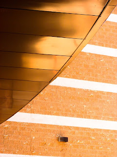
 These are my last photos from my final project. The first one is of the movie theater near my house and I loved the rectangular shape of the building with the rounded edge of the lower roof. It was a big contrast but it was totally cool. The color is similar too but it's still different enough to show the contrasts between shape. The second one is of the same movie theatre and I loved the layers of the signs and the lines and color of it. It's so unique and I love the layers how it creating different shapes and designs. I've wanted to shoot this sign for a year and I finally did it. Haha. I love the contrast between the red letters and the yellow back. The third one is of a business place and I loved the zigzag pattern of the building on top because usually buildings aren't zigzag, they're flat or rectangular. It's a simple shape but it's so unique, I love it. I love how the zigzags aren't all the same too, like when one of the places it caving in the layer below it is jagging out, so it makes it not too symmetrical. The fourth one is of another business building. There was a straight line going up and so I just stood close to the base of the building and looked up to take it. My first shot of it was too close and you couldn't see any details so I backed up a little and it was a lot better. I really like the symmetry and the intersecting lines. Sometimes symmetry is boring, but because of the cool lines and different colors, it's interesting. I like the gold on either side and it doesn't coincide with the other colors or take away the attention, it adds to the building.


4 comments:
I really like architecture and leading lines so I think these images have really good composition. I like how the sky is in some of them adding a little bit of color. Nice images!
I really like the simplicity of the image. I am a fan of how simple and elegant you carried this out. Nearly all the images have excellent leading lines and balance. NICE! plus the color balance looks good and i know that that was obnoxious for you, but you put that fire out. we should vall you the fireman. i mean firewoman.
These images are strong because of leading lines and strong composition i like them a lot good work!
i love the leading lines, you did a great job, its so simple yet really beautiful at the same time. It also shows who you are as an artist, and all the photographs match one antoher i like it a lot!!
Post a Comment