Monday, March 30, 2009


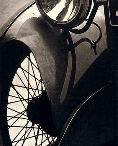
This is a photo of Paul Strand. I really like this because I can't tell what it is. It's abstract to me. It looks like a car but I'm not sure. I really like how it's black and white and the shadows and light are also very cool. I really like how the light hits and how it creates fading shades of gray on the car and darker shadows. The bottom of it kind of looks like a window with lines on it, but when you look at it whole then it's not a window anymore.

Thursday, March 26, 2009

Fixed Bracketing


This image was kinda hard to fix because when the candle looked good then the windows would be way too bright. I had to choose a darker image to work with so that the highlights would be better and the candle would look better as well. After fixing the blacks, highlights, and candle, it looked way better. I'm really happy I cropped out the side of it because it had the side of a chair in it which was very distracting, so I cropped it.

Assignment 1 Bracketing


This is really weird because it made the dark one darker than it was and the light one lighter than it really was so....I don't like these brackets as much as the flower ones but that one didn't have any light ones because it was a different way to do it.

Wednesday, March 25, 2009

I shot this photo for the bracketing assignment and I really like the brightness of the flowers. How they're yellow is really pretty and I also like the light hitting on the vase. I just wanted to get through the assignment so I just chose an object close to the window for natural light and shot it. Haha. I shot this in the morning at about 11 so yeah.

Exporting

Choose where it's going, usually assignment folder. Then for template choose custom name and if it's print then do flower_print and if it's web then do flower_web. For the web the format is jpeg. The quality is 80. The internet's color space is sRGB.If you're printing then use proPhoto RGB. Click resize to fit and click long edge. Choose ten inches. The resolution is 72 pixels per inch. For the web only, click in output sharpening and put it to standard.For post processing for the internet it says do nothing.

Monday, March 23, 2009

every single one of my photos is always cut off!!!!!!!!!!!!!!!!!!!!!!!! uggh!!!!!!!!!!


I really like this image by Shomei Tomatsu. I love how her black hair pops against the white and light gray of the pillowcase and covers. Her face is also very pretty and the shadows are awesome in the photo. The shadows on her arm and collarbone create a depth of her own body and skin. I love how she doesn't have much of a facial expression and it makes it even more beautiful because the whole thing is simple. I just absolutely love the shadows!!!!!!!!!!!!!!!!!!!!


This is a photo by Henri Cartier Bresson and I love it because of the blue that pops out on the bottom of the image. I also like the simplicity of the image how everything is all white. It's so modern and white and beautiful. The three black chairs are also very popping because it's the opposite of white and the blue kind of disappears on the wall by the time it gets to the chairs. The blue shadows cast behind the chairs are also very pretty because it reminds me of a peacock and rainbow even though there's not all the colors. The spectrum of the colors is so pretty. I love how the floor is blue because it's so unexpected. Usually floors are white or beige or black or carpet.

Saturday, March 21, 2009

Does anyone know how in the world to get the histogram on the camera to come out?

Thursday, March 19, 2009


This is a photo by Irving Penn for Loreal. I love the colors spreading out from the lips like flowers and it really contrasts from the pale skin. The pale skin is kind of scary though because it reminds me of one of those really pale creatures in horror movies or those floating ones. The color is popping and really beautiful though. I just don't like how the photo starts at her nostrils though, that's not very attractive.

Wednesday, March 18, 2009


I love this photo by Man Ray. The water drops are so characterizing. They're so 3D and real. It's so strategically placed. The eyelashes really match the drops too because at the end of the eyelashes are small points/dots and that matches the water drops because both are round. I love the water. It goes with the entire eye. The paleness of the skin is also makes the eyelashes stand out more because they're really black.

Monday, March 16, 2009

Uggh.....! Every single photo I put is cut off!


This photo is by Patrick Demarchelier and I think it's a fashion photo but I still like it. I like the strong makeup on the model because it's very powerful and it's like she can stare you down. It's so sharp and dark. If I think the other side, she is very dark and evil. Like one of those mean. girls that walk out on the street in NYC wearing this sweatshirt and her posse. I love the contrasty feel of her sweatshirt and her makeup. The sweatshirt is soft and light while her makeup is the opposite.

I like this photo by Patrick Demarchelier because of its unbalanced proportions. The rose is huge but somehow it doesn't take all the attention. I still notice the woman that's under the rose. I think this is because the rose leads to the woman. She is its stem and normally, flowers have stems but since this one doesn't we naturally search for one. I love how the woman's face is half covered. It makes it more beautiful and more mysterious. The shadows on her body are also very good. It's dramatic and hits very sharply. Half of her is light and the other is dark. I also love the shadows on the rose because it enhances the 3D feel of the rose. It makes it feel more silky and more lively and existing.

I really like this photo by Annie Leibovitz. This background is so simple and that's why I really like it. I really like the shadows on the floor made by her position and the awesome lighting techinques. I like the position and jumping that she is doing. This pose is so powerful. It shows that she can dominate anything but is still feminine based on the dress that she's wearing. I love how the dress is powerful also because it whips around her with lots of energy while she herself is executing this jump. The lighting overall is so good, how it hits only half of her and fades into black. I feel like I can see the entire photo really detailed because the background is so simple. It really brings out the woman.


I love this photo by Irving Penn and the expression and light on her face, neck, and shoulders is so amazing. Her facial expression shows pride and beauty. I love how her neck has the shadows and how the bones on her shoulders have shadows on them. I love the second background to the left. It adds a little bit of uniqueness to the photo rather than the perfect background. I love the position her body is in, how it's bent and show off the blackness of the fishtail dress better. This photo just captures so much glamour and classiness. The entire image just surprises me and just makes me think WOW. The lady reminds me of the designer Carolina Herrera and she is so talented and seems like she never gives up. This lady had the exact expression that Carolina had on a magazine. I love this photo.

Balenciaga Dress


I love this photo of the Balenciaga dress by Irving Penn. It's gorgeous! I love the expression on the face of the model and how her face is veiled. It makes her face a little more mysterious and she seems more controlling. She's seems sharp and the type of woman that could go out by herself in the 1900s without a chaperone. Someone brave. The dress itself is beautiful. The ruffles and the shadow on them is gorgeous. The light of the ruffles is really good. I like how it goes from the light to dark and gray. The tones are really cool. I also really like the wing things on the side. They're very creative and add to the photo rather than if they weren't there.