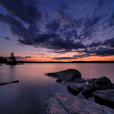
To make a good photo I think emotion is really important. If you feel one way but you try to shoot another emotion then the photo will turn out bad because it's not what you really want/feel. It's more fake and it's not sincere. Every image should have an emotion when the viewer looks at it because then it's a meaningful image having some importance to it showing the photographer's feelings. Another thing that's important is the composition. If it's bad composition then the photo won't be as strong and won't have as much feeling in it. If it's a good composition, most of the time, it automatically has emotion and feeling in it. When I shoot a good image, I have this feeling in me that the image is going to be strong. I think composition is more important than emotion because composition is basically one of the big factors that makes or breaks an image. A third thing that's very important is color. If the white balance is off then the whole image looks weird and it doesn't look as clean cut and good. I learned that lesson when I didn't really care about white balance and I was always like oh that looks close enough, but it wasn't. It turned out ugly and I couldn't print some images to turn in because of this. Color is what sharpens the image and it's what enriches the image. A vibrant red can cause lots of emotion and make the image strong while a bad red doesn't show anything. It shows bad white balance and bad color.
 These are some of the photos from my final project. I wanted to show a different view of buildings and architecture. I wanted to show the part of the building that was unique and different. The first one is of the Salt Lake Library with another metal structure by it. I thought it was really cool how the slanted edge of the library differs with the roundish shape of the structure by it, how the structure dips down. I love the shape of it. It's a simple combination but it's so much. The second one is of the library also but it's another view of it. I saw that little window sticking out and usually windows aren't that shape so I thought it was simple and unique. I didn't want the photo to be all that color so I added some sky into it to make the shape interesting. I like how the side of it slants down instead of being straight. The window isn't symmetrical and I really like that because it's not perfect but it's unique. The third one is of the Salt Lake City city hall and it's the bottom side of one of the sides. I love how the it's round closer to me and how the building slants out in the back. I love the differing shapes. I also really like the texture of the rock and how cool it can be when you sharpen it up. If it was just plain it wouldn't have been as cool and unique. I like the reflection in the window because it would have made the picture more plain without it. The green at the bottom adds to the photo also because it creates a contrast between the green and the yellowy color of the stone.