Wednesday, April 29, 2009

Assignment 4- Panorama 3


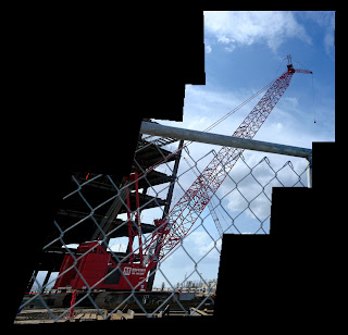
This is my 3rd panorama. I really like this one because of the shapes and the whole thing how it goes up. I wasn't originally going to take photos of this but I decided to do it because I saw it and I was like this is awesome. I really like the red of the color because it stands out against the sky and the black construction behind it. This is really cool and I love panoramas.

Wednesday, April 22, 2009

Assignment 4- Panorama 2


I don't like this panorama as much as my first one of Liberty Park. I decided to crop off a lot of the blue sky at the top because I thought there was way too much. I like the other one better because it seems more beautiful and more likable and this one is more angled and up. I like horizontal panoramas better I guess. This one is of the Wells Fargo building downtown and I took it the same day as the Liberty Park one. This one I like the shapes on the building, the rectangles of the window and and angled structure, but that's all I like of it.

Assignment 4 Panorama 1


This is my first panorama and it's of the pond in Liberty Park. I shot it on Sunday and the weather was so nice. I loved it there. I love how blue the sky was and the shadows of the trees. The entire panorama just makes me feel so spring and summer. I love the color of the green green grass and the blue color of the pond thing. I also like how black the trees are. It creates more contrast in the photo. I love this photo.

Wednesday, April 15, 2009

Assignment 3 Not Printed


This is my assignment 3 not printed. I really like the fading one. I think it was a close up of one of the panels on my window while it had shadows and light. I really like it though because it's very abstract. There's not much to it and it's very simple, but it's cool because you can't tell what it is. It's just the color that's cool. The stairs one I think is cool because it's a different perspective of stairs. It's not how you'd usually look at them. It's just corners of it and usually you'd look at them straight up or from the front or something regular. It's more different this way.

Panorama

Export as TIFF. Must go into Photoshop to do panorama. Work on images individually in lightroom. Go to file and then automate and then photo merge. Choose auto, perspective or cylindrical for layout. Click on browse go to images and then choose one. It will automatically find all images. Hit ok. Can add another layer and fill with black and add a border. To make the lines straight first put guides in to show you what is straight. The ruler is Ctrl-r or Alt-r. They work horizontally or vertically. Go to ctrl quote shows the grid. Select all the pixels by going to select all in select. Then go to edit and go down to transform and then distort. Click and grab anchors to change into whatever shape I want. Play with it and figure it out.

Assignment 2 Not Printed


These two photos are from my rhyming that I didn't print. I wanted to put up another fan one because it's showing the other side of the fans. I like how the white pops out agains the tan/brown and the white and flowers really stand out. I also really like the fake orchids. I love the color pink and I love how it's zoomed in and not the entire flower pot. I like how I cut off a little bit off the orchids and how it's just 2 orchids.


Assignment 3-Time/6 Hours

This is my assignment #3-the 6 hours one. I don't like this assignment as much as the assignment 2. I really like the crack in the sidewalk but it's supposed to be vertical, and I forgot to rotate it. I really like the texture of it and the sharpness. The design is very simple so I like it a lot. I also like the darkness of the crack itself. It differenciates from the whiteness of the sidewalk. The number one I took from our car and I like the reflection from the numbers. I also like the dirty spots and stuff that are on the numbers. I also really like the reflection of the light on the numbers. It gives it a little bit of uniqueness.


Assignment 2 Rhyming


This is my rhyming assignment, and I really like the fan photo. I really like the composition and shape for it. It's a beautiful shape and the colors are all different. I love how the center of the fans isn't exactly in the center of the photo. It's more unpredictable that way. My 2nd favorite is probably the lamp one. I took it at night and the light shown on my bedroom wall. It was very pretty. It's something very simple but it's weird because I've never noticed it before. The simplicity of it really caught my eye. I also love how it's a warm dark color. It makes me feel very cozy and warm. The next favorite is the railing one. I love the leading line that goes from bottom to hot. I never noticed it before when I passed it a lot everyday, but somehow I just saw it. I love how it's sharp and straight. It goes all the way up and it just leads your eye to the top, but it doesn't take it off the photo. It kind of circles your eye around to the painting and back down the stairs. It's a circle. The rose is very pretty. I've always wanted to take a color picture of it so I finally did it. The background was hard to recover though because the highlights were so bad. I really like the color of it and how the background matches the rose, very classical.


Monday, April 13, 2009


This is a photo by Ansel Adams and I love the shadows on the sand of the desert. It's beautiful. It's so unrealistic because of how beautiful it is. I love the dramatic fade of color from black darkness all the way to lighter. It's beautiful. I love the shape of the sand and it's so simple, but the shape of it completely changes the photo. It's so much more interesting because of the curves of the sand.

Wednesday, April 8, 2009


I really like this photo by Dong Hong Oai. I love the sand blowing up. It's like an art of itself and I love the color. It really stands out against the rest of the background. I also really like the position of the person how the balance is slanted. I love how the color of the two baskets and of her pants stand out against the white blowing sand. It's a gorgeous photo. It seems very dreamlike because of the misty quality of the sand.

Printing

Color Management mangaged by lightroom. Profile managed by other and find profile on list, choose the one that's Louis Daguerre for my printer. Click print sharpening and put it on standard. Media type is glossy. Print Resolution on 360. Print to printer.

Thursday, April 2, 2009


This is an image by Louis Daguerre and I think it's beautiful. The light coming in from the window is so beautiful and it just enhances the entire feel of the building. It's the perfect lighting, not too much and not too little. I also like the glowy feel of the entire place even though it's a little gloomy. I love the details of the ceiling and the pillars. The art and the carvings are so beautiful. I also like how the people are in it also because it makes it look less like just a tourist photo. It makes it look like a real image. That little detail adds color to the image because the building itself is very plain colored and the clothing is red and white and black rather than gray and brown and dark red.


I really like this image by Paul Strand because it's so simple with just a couple of good details. I like the blackness of the trees because it sticks out against the brown of the lake? The mist at the back also adds to the picture. It's a cool detail and it just makes the trees pop more because everything else around it is brown. I also really like the shadows cast in front of the trees because it makes the photo more mysteriousness and gloomy. I really like the color of the sky how it fades from brown to gray. It's very beautiful like that kind of misty beautiful with that mystery in it.

Wednesday, April 1, 2009


This is an image by Yang Yan Kang and I think it's awesome because of the mist and the swirls on the ground. I also like how ancient and long ago this cart in the middle looks. It looks like I was brought into a long ago world. The misty mountains makes a sort of mysterious feel. It's kind of scary and how the lady is dressed in black adds to the mystery and cool senses.